Over at skeptical science they have a hard on for John Christy because he does not agree with their alarmism regarding the Global Warming Hoax. Here I rebut each of the issues that they take him to task for.
Climate myths by Christy in quotes with what they say the Science Says without quotes. My comments in bold:
“CO2 limits will make little difference” If every nation agrees to limit CO2 emissions, we can achieve significant cuts on a global scale.
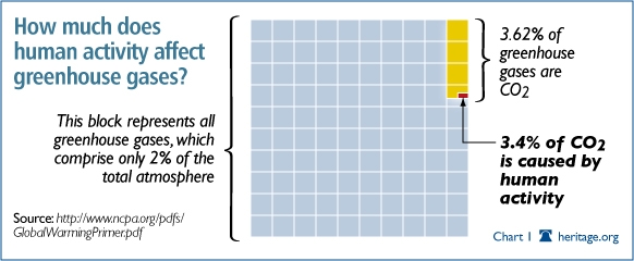
Humans contribute less than 3% of the increase in atmospheric co2, there would be no significant cuts if all human output as stopped.
“It’s Urban Heat Island effect” Urban and rural regions show the same warming trend.
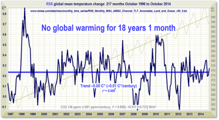
There has been no trend for over 18 years.
“CO2 limits will harm the economy” The benefits of a price on carbon outweigh the costs several times over.
The benefits they calculated seems to be based upon tax subsidies, tax on carbon, and do not consider the huge increase in the cost of renewable energy as compared to fossil fuel.
“Models are unreliable” Models successfully reproduce temperatures since 1900 globally, by land, in the air and the ocean.
They say. “Climate models have to be tested to find out if they work. We can’t wait for 30 years to see if a model is any good or not; models are tested against the past, against what we know happened. If a model can correctly predict trends from a starting point somewhere in the past, we could expect it to predict with reasonable certainty what might happen in the future.”
None of the models predicted the pause, and not one of them track what has been happening for the past 18 years and counting. “We can’t wait for 30 years” well we have waited nearly 20 years with no increase in spite of the continual growth in the co2 that we are add to the atmosphere every one of those years.
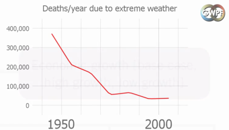
“Extreme weather isn’t caused by global warming” Extreme weather events are being made more frequent and worse by global warming.
Here’s what the IPCC says:
Current data sets indicate no significant observed trends in global tropical cyclone frequency over the past century and it remains uncertain whether any reported long-term increases in tropical cyclone frequency are robust, after accounting for past changes in observing capabilities.… No robust trends in annual numbers of tropical storms, hurricanes and major hurricanes counts have been identified over the past 100 years in the North Atlantic basin.
“CO2 limits will hurt the poor” Those who contribute the least greenhouse gases will be most impacted by climate change.
In my opinion this is on part what the whole Global Warming Hoax is all about, a giant wealth transfer from America to all the Third World Countries.
“It’s not us” Multiple sets of independent observations find a human fingerprint on climate change.
I will only address one of their so called fingerprints, “Humans are currently emitting around 30 billion tonnes of CO2 into the atmosphere.” CO2 is only .04 percent of the atmosphere in total, and humans only produce about 6% of all CO2 emissions in a given year. Then consider that at no point in history has CO2 ever been known to be static, and in the past it rise has always followed temperatures rise by about 800 years.
The question thus eases in my mind is if co2 is driving the temperature increase why have there been no increase in temperature since 1996 when the co2 was around 358 ppm, now it is round 400 ppm but the temperature has stayed statically flat.
“It’s not urgent” A large amount of warming is delayed, and if we don’t act now we could pass tipping points.
How do you delay heat? The sun heats the earth in the same manner as an oven heats the food in it, by radiated energy. The heat generated by the sun can no more be delayed in heating up the earth that the heat being generated in an oven can be delayed in the duck you are cooking. As soon as you turn off the heat the oven starts to cool. Open the door and it will cool faster by heating up the kitchen, the heat is not stored and cannot re-enter the oven to cook with at a later time.
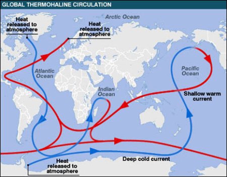
The alarmist have put forth the idea that the heat is being stored in the oceans, but have not offered a mechanism with which it could be moved from the surface to the depths. See warm water is lighter than cold water because it is less dense due to the expansion of it molecules as it is heated up, as a results the oceans are divided into layers with the warmer being on top, the top layer can only sink to the bottom when it is carried to the poles and gets colder than the water it is sitting on, and then it sinks to the bottom only to come up again to replace the water being sent north with the Gulf Stream.
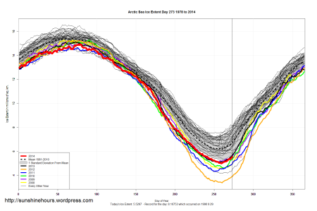
“Arctic sea ice loss is matched by Antarctic sea ice gain” Arctic sea ice loss is three times greater than Antarctic sea ice gain.
Not any more In fact it is starting to increase: “Sea ice extent in November averaged 10.36 million square kilometers (4.00 million square miles). This is 630,000 square kilometers (243,000 square miles) below the 1981 to 2010 long-term average of 10.99 million square kilometers (4.24 million square miles) and 520,000 square kilometers (201,000 square miles) above the record low for the month observed in 2006.” Arctic sea ice conditions.
“Temp record is unreliable” The warming trend is the same in rural and urban areas, measured by thermometers and satellites.
Again, there has been no trend for 18+ years.
“Earth hasn’t warmed as much as expected” This argument ignores the cooling effect of aerosols and the planet’s thermal inertia.
No, it points much more to the inability of any of the models to predict what the warming rate will be. If the cooling effect of aerosols and the planet’s thermal inertia are things that affect temperature they should have been taken into account when constructing the models that predicted the future temperature. Instead they locked stepped the models with the rise in co2, which has not stopped, to the predicted rise in temperature which has stopped.
“Satellites show no warming in the troposphere” The most recent satellite data show that the earth as a whole is warming.
For September 2014, the latest data I can find, the UAH lower troposphere temperature anomaly is +0.30 deg C. It rose (an increase of about +0.10 deg C) since August 2014. Well, I reckon that you can count that as a little warming, but what caused it is an open question.
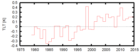
The annual mean time series is shown in Fig. 1. It starts at the beginning of the modern satellite era, in 1979. This is in stark contrast to the global mean near-surface temperature that can be reasonably accurately reconstructed to the end of the 19th century. The short record is one of the reasons it is not used much in climate science.
The global mean TLT differs from the global mean near-surface temperature in a few key aspects. One of them is that the influence of El Niño is much larger, as can be seen from, e.g., the height of the peak in 1998, which is about 0.4 K above the trend line, against about 0.2 K in the near-surface temperature. Note that strongest effects of El Niño on temperature lag the event itself by about half a year. The 2010 peak is also higher, about 0.2 K versus only 0.1 K. On a map, this can be seen as a stronger and broader response to El Niño and La Niña in the tropics, see Fig. 2. The amplification can easily be understood due to the stronger warming at height caused by the heat of condensation of the higher rainfall. This is the upper tropospheric warming that accompanies an increase in SST in the tropics. In the deep tropics, near the equator, this causes heating well above the lower troposphere and hence is not clearly visible in the TLT, but away from the equator the warmer air descends in the Hadley circulation and enters the heights to which the TLT is more sensitive. Climate Lab Book
“Climate sensitivity is low” Net positive feedback is confirmed by many different lines of evidence.
There are two ways of working out what climate sensitivity is. The first method is by modelling: Climate models have predicted the least temperature rise would be on average 1.65°C (2.97°F) , but upper estimates vary a lot, averaging 5.2°C (9.36°F). Current best estimates are for a rise of around 3°C (5.4°F), with a likely maximum of 4.5°C (8.1°F).The second method calculates climate sensitivity directly from physical evidence, by looking at climate changes in the distant past:
The first method went to hell in a handbasket 18 years ago, and the problem with the second method is that in the past the rise in co2 lagged the rise in temperature on an average of 800 years.
Ice cores from Antarctica show that at the end of recent ice ages, the concentration of carbon dioxide in the atmosphere usually started to rise only after temperatures had begun to climb. There is uncertainty about the timings, partly because the air trapped in the cores is younger than the ice, but it appears the lags might sometimes have been 800 years or more. Newscientist.com
“There’s no tropospheric hot spot” We see a clear “short-term hot spot” – there’s various evidence for a “long-term hot spot”.
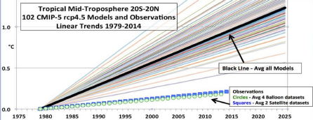
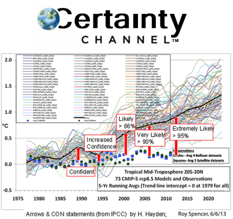
The (missing) tropical hot spot is one of the long-standing controversies in climate science. Climate models show amplified warming high in the tropical troposphere due to greenhouse forcing. However data from satellites and weather balloons don’t show much amplification. What to make of this? Have the models been ‘falsified’ as critics say or are the errors in the data so large that we cannot conclude much at all? And does it matter if there is no hot spot? Summaries online:
skepticalscience.com has this to say:
What does the full body of evidence tell us? We have satellite data plus weather balloon measurements of temperature and wind strength. The three satellite records from UAH, RSS and UWA give varied results. UAH show tropospheric trends less than surface warming, RSS are roughly the same and UWA show a hot spot. The difference between the three is how they adjust for effects like decaying satellite orbits. The conclusion from the U.S. Climate Change Science Program (co-authored by UAH’s John Christy) is the most likely explanation for the discrepancy between model and satellite observations is measurement uncertainty.
And what does that tell me? It tells me that whether or not there is a tropospheric hot spot is an open question.
“It’s microsite influences” Microsite influences on temperature changes are minimal; good and bad sites show the same trend.
Again, for the third time, there has been been no trend for 18+ years.
“It warmed before 1940 when CO2 was low” Early 20th century warming is due to several causes, including rising CO2.
From skepticalscience.com
Before 1940, the increase in temperature is believed to have been caused mainly by two factors:Increasing solar activity; and Low volcanic activity (as eruptions can have a cooling effect by blocking out the sun).Other factors, including greenhouse gases, also contributed to the warming and regional factors played a significant role in increasing temperatures in some regions, most notably changes in ocean currents which led to warmer-than-average sea temperatures in the North Atlantic. Does this mean that solar activity is also primarily responsible for late 20th century warming? In short, no. Solar activity since the 1950s has been relatively stable and therefore cannot explain recent trends. Similarly, increased volcanic activity may actually have had a cooling effect in recent decades. On the other hand, greenhouse gas concentrations, which were relatively low pre-1940, have increased considerably and are now dominating the climate system. This highlights the need to look at all factors when determining which factors are likely to be affecting climate at any one time.In short, there’s no reason to assume that because the sun was responsible for early 20th century, it is responsible for all warming. The evidence strongly suggests that current warming is mainly the result of increasing greenhouse gas levels.
The disallowance of the sun as cause of the earth’s warming for the last fifty years seems a bit self serving to me, and there is no reason not to assume that the sun was not responsible. The only evidence that suggests the current warming is mainly the result of increasing greenhouse gas levels is one of correlation which stopped 18+ years ago.
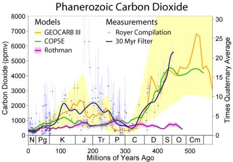
“CO2 was higher in the past” When CO2 was higher in the past, the sun was cooler.
Yes, and the co2 did not start increasing until after the earth warmed!
From skepticalscience.com
Another important factor is the sun. During the Ordovician, it would have been several percent dimmer according to established nuclear models of main sequence stars. Surprisingly, this raises the CO2 threshold for glaciation to a staggering 3000 ppmv or so. This also explains (along with the logarithmic forcing effect of CO2) why a runaway greenhouse didn’t occur: with a dimmer sun, high CO2 is necessary to stop the Earth freezing over.
Stellar evolution is not studied by observing the life of a single star, as most stellar changes occur too slowly to be detected, even over many centuries. Instead, astrophysicists come to understand how stars evolve by observing numerous stars at various points in their lifetime, and by simulating stellar structure using computer models. A lot of assumptions go into these model, just like the ones used to model climate. One false assumption, like temperature is driven by co2, and the whole model falls apart. Unlike with climate models which is in the process of being falsified, they cannot be tested except by observation and opinions. Outside of faith there is no way of knowing if the syn was warmer or cooler way back then.
“CO2 is plant food” The effects of enhanced CO2 on terrestrial plants are variable and complex and dependent on numerous factors.
One of the most consistent effects of elevated atmospheric CO2 on plants is an increase in the rate of photosynthetic carbon fixation by leaves. Across a range of FACE experiments, with a variety of plant species, growth of plants at elevated CO2 concentrations of 475–600 ppm increases leaf photosynthetic rates by an average of 40% (Ainsworth & Rogers 2007). Carbon dioxide concentrations are also important in regulating the openness of stomata, pores through which plants exchange gasses, with the external environment. Open stomata allow CO2 to diffuse into leaves for photosynthesis, but also provide a pathway for water to diffuse out of leaves. Plants therefore regulate the degree of stomatal opening (related to a measure known as stomatal conductance) as a compromise between the goals of maintaining high rates of photosynthesis and low rates of water loss. As CO2 concentrations increase, plants can maintain high photosynthetic rates with relatively low stomatal conductance. Across a variety of FACE experiments, growth under elevated CO2 decreases stomatal conductance of water by an average of 22% (Ainsworth & Rogers 2007). This would be expected to decrease overall plant water use, although the magnitude of the overall effect of CO2 will depend on how it affects other determinants of plant water use, such as plant size, morphology, and leaf temperature. Overall, FACE experiments show decreases in whole plant water use of 5–20% under elevated CO2. This in turn can have consequences for the hydrological cycle of entire ecosystems, with soil moisture levels and runoff both increasing under elevated CO2 (Leakey et al. 2009).
It looks like a good response to me.
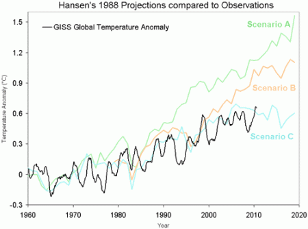
And lastly: Hansen’s 1988 prediction was wrong” Jim Hansen had several possible scenarios; his mid-level scenario B was right.
From skepticalscience.com
‘On June 23, 1988, NASA scientist James Hansen testified before the House of Representatives that there was a strong “cause and effect relationship” between observed temperatures and human emissions into the atmosphere. At that time, Hansen also produced a model of the future behavior of the globe’s temperature, which he had turned into a video movie that was heavily shopped in Congress. That model predicted that global temperature between 1988 and 1997 would rise by 0.45°C (Figure 1). Ground-based temperatures from the IPCC show a rise of 0.11°C, or more than four times less than Hansen predicted. The forecast made in 1988 was an astounding failure, and IPCC’s 1990 statement about the realistic nature of these projections was simply wrong.’ (Pat Michaels)
And give this graph:
What do we learn from James Hansen’s 1988 prediction?
Link to this page
What the science says…
Select a level… Basic Intermediate Advanced
Hansen’s 1988 results are evidence that the actual climate sensitivity is about 3°C for a doubling of atmospheric CO2.
Climate Myth…
Hansen’s 1988 prediction was wrong
‘On June 23, 1988, NASA scientist James Hansen testified before the House of Representatives that there was a strong “cause and effect relationship” between observed temperatures and human emissions into the atmosphere. At that time, Hansen also produced a model of the future behavior of the globe’s temperature, which he had turned into a video movie that was heavily shopped in Congress. That model predicted that global temperature between 1988 and 1997 would rise by 0.45°C (Figure 1). Ground-based temperatures from the IPCC show a rise of 0.11°C, or more than four times less than Hansen predicted. The forecast made in 1988 was an astounding failure, and IPCC’s 1990 statement about the realistic nature of these projections was simply wrong.’ (Pat Michaels)
In 1988, James Hansen projected future warming trends. He used 3 different scenarios, identified as A, B, and C. Each represented different levels of greenhouse gas emissions. Scenario A assumed greenhouse gas emissions would continue to accelerate. Scenario B assumed a slowing and eventually constant rate of growth. Scenario C assumed a rapid decline in greenhouse gas emissions around the year 2000. The actual greenhouse gas emissions since 1988 have been closest to Scenario B. As shown below, the actual warming has been less than Scenario B.
As you can see his closest prediction to the actual rise in temperature is with Scenario C which assumed a rapid decline in greenhouse gas emissions around the year 2000 when in fact the co2 level continued to rise to near 400 ppm. None of his prediction foresaw the pause!
No comments:
Post a Comment